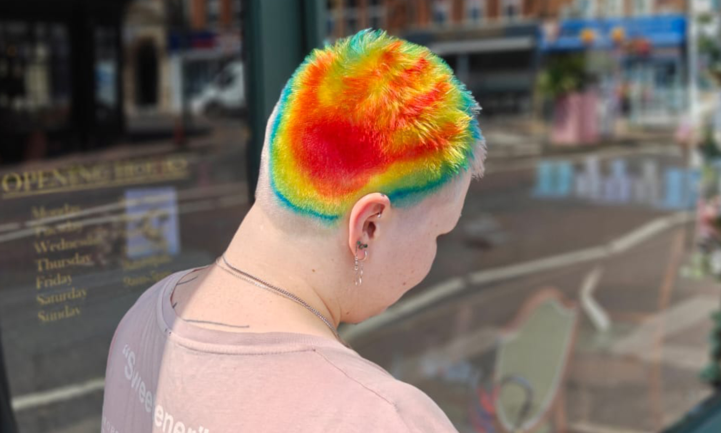
Warren Edwards, Creative Director at Bournemouth’s Warren & The Hare, gives an inside look at the creative process behind his hawt new look – heatwave inspired hand-print hair.
I’m never one to shy away from anything creative, so I absolutely love it when a client comes to me with an unexpected source of inspiration. The more unconventional, the better. First it was pigeons, and this time the idea came from something that had been impossible to ignore, the recent UK heatwave and the thermal weather maps that seemed to be everywhere.
Rather than taking the obvious route of creating a bright, beachy summer look, we wanted to capture the feeling of summer in a completely different way. Those striking weather maps, with their bold gradients of orange, yellow, green and blue, became our mood board. Designed to represent atmospheric conditions like temperature, rainfall and intensity, they have an almost abstract, painterly quality that felt perfect for translating into hair.
During the consultation we spent time studying the thermal weather maps together, paying close attention to how the colours shifted and melted into one another as the hottest temperatures spread across the UK. It wasn’t about recreating a map exactly, but about capturing that fluid movement and the energy of the colours themselves.
To create the perfect canvas, we started with a fresh scalp bleach using Crazy Colour Highlight Violet Lightener. Once the hair had lifted cleanly, I toned it with Crazy Colour Platinum Punk to achieve a crisp, even blonde that would allow every shade to appear as vibrant and true to tone as possible.
With the base ready, it was time to get creative. Instead of applying colour with traditional sectioning, I used my hand as a stamp to create the first bold print. This became the focal point of the design and instantly gave the look an artistic, almost experimental feel. From there, I switched between different sized brushes, paint brushes and even my fingers to build up layers of colour. Working this way allowed me to carefully control both the placement and saturation of each shade, creating depth and movement rather than solid blocks of colour.
I began with a vibrant orange handprint before layering Canary Yellow, Lime Twist and Sky Blue over the top. Using my fingers to gently smudge and blur the edges alongside the brushes helped the colours melt into one another, echoing the seamless gradients seen across the thermal maps.
The finished result feels bold, expressive and unapologetically artistic, a wearable interpretation of one of the UK’s hottest summers, proving that inspiration can come from the most unexpected places.